
Copywriting and Design Strategies for Better Donor Newsletters: Fundraising copywriter Lisa Sargent and designer Sandie Collette, of S.Collette Design, discuss how copywriting and design go hand-in-hand to make a Dublin-based charity's newsletter overhaul a success. In this non profit newsletter case study, discover the strategies that helped make it happen. |
|
TO VIEW PDFs IN NEW WINDOW,
There is an emerging trend in newsletters to go with a sanserif font. But we still adhere to the old rules of readability: serif font for print, sanserif for online. This is especially true if your donors are of the 45-70 age group. They’re already reaching for their cheater specs, so don’t go all funky on them.
|
By Lisa Sargent
More |
Let’s begin with results. Shortly after my design colleague Sandie and I finished an overhaul of Merchants Quay Ireland’s donor newsletter, I received an e-mail from MQI’s Head of Fundraising that read:
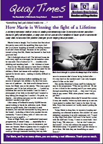
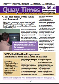
Four weeks later, the donations from that newsletter stand at €16,000 (roughly US$21,000). Even better, those revenues will soon double – the result of a matching gift on all Christmas donations up to €50,000 (a challenge you can bet we featured prominently in the newsletter). ROI for this newsletter, after creative, printing and mailing costs is 3:1. 13 Copywriting and Design Strategies That Note 1: Note 2: 1. Choose Your Colors: One of the first things to consider is the color scheme. You’ll save on costs with two-color printing, but if you can manage four-color, it’s a much nicer look. (The ‘after’ version of MQI’s newsletter is four-color.) In considering colors for sidebars, masthead, etc., strive for harmonious colors that are also consistent with the ‘feel’ you want to establish. In the samples, you’ll see that MQI’s chief color is purple and, while this dictated the main accent color, Sandie chose a different complementary color to warm things up – in this case, gold. 2. Consider the Masthead: Here is where you see a big difference between the before and after versions. The already-established newsletter name, “Quay Times,” was very difficult to read in the before version. So Sandie strived to give the name a more dominant presence – and we knew she’d been successful when donors began referring to the newsletter by name. In fact, just by glancing at the thumbnail images at left, you can clearly see a difference in the before and after mastheads, and the ease with which the title of the newsletter is legible. 3. Add a Table of Contents: One of your jobs, in any multi-page communication, is guiding readers to the next page… and the next. A table of contents helps accomplish that. In this case, it’s straight up at the top in the masthead, which saves space and lets people easily see what’s inside without making a big deal out of it. It also gives scanners and skimmers a bite-sized summary. 4. Select Proper Font and Type Size: There is an emerging trend in print newsletters to go with a sanserif font. But we still adhere to the old rules of readability: serif font for print, and sanserif -- or sans serif -- online. This is especially true if your donors are of the 45-70 age group. They're already reaching for their cheater specs, so don't go all funky on them. You can use sanserif sparingly in print, yes -- and we do. But for body copy, we stick with serif; the one we use in the ‘after’ version is among the most readable. As to type size, Sandie used 11 pt on 13, which means an 11 point type size with 13 point leading (the space between the lines). Sidenote: beware reversed-out text. This is fine to use (again sparingly) when there’s enough contrast and not a lot of copy, as you’ll see on the cover page of the ‘after’ version; reversed-out text is notoriously tough to read in long stretches. For a fabulous primer on this, see Colin Wheildon's Type & Layout. 5. Use Photos Always: In smaller and mid-sized nonprofits, it can sometimes be a challenge to get good quality, high-resolution photos. But MQI faces a different problem: in working with those who are homeless and have addiction problems, many of the women and men they help wish to remain anonymous. For this reason there are not many full face photos, which of course are best of all, because the eyes engage. Even so, we opt to give readers even a sideways glimpse of the real people they are helping, as opposed to a stock photo of complete strangers; it's much more authentic that way. 6. Guide the Reader: As we noted in the Table of Contents section above, one of the main jobs of any multi-page communication is to guide the reader through from page to page. But you also have to guide the reader through each article – and at the same time write for skimmers and scanners, who will never read your newsletter in its entirety. This means:
Note in the ‘after’ version how Sandie uses design to clearly differentiate between the head, deck and body copy. And if there are pull-quotes, they stand out too. 7. Thank the Reader and Show Accomplishments: Wherever possible, without getting too saccharine, we say thank you. Our goal here is to show the reader, through stories, testimonials, profiles and more, all the amazing things their donations are making possible... this, after all, is the reason you're writing. One of the ways we accomplish this is by using a thank-you message as a built-in design element: in the headers of both inside spread and page 4 (back cover). 8. Break Up the Copy: With any newsletter, we plan for a mix of full-length articles and shorter snippets of information – bulleted points, pull-quotes, call-out boxes with bits and pieces of news, shaded areas. This, again, helps skimmers and scanners get what they need, and also adds visual interest. (You’ll notice a big difference here between before and after versions.) 9. Don’t Be Afraid of Numbers: You’ll notice a pie chart on page 2 – we always include some form of graphic that shows how a donor’s money is being wisely used. And don’t be afraid to sprinkle numbers in elsewhere – in the form of statistics and percentages, for example – just be sure you explain them clearly, and always bring it ‘round to the donor’s role in all of it. 10. Include Inside Information: It’s a hard and fast rule not to bury your readers in jargon. But I don’t think you need to ‘dumb everything down,’ either – and in fact, there are certain cases where including jargon or technical terms can make the reader feel like an insider. In addition to copywriting for the 'after' version, I also did some of the copywriting -- and all of the copyediting -- to MQI’s ‘before’ version (which is the summer issue of their newsletter). Look at page 3 of that issue, “A Day in the Life of a Merchants Quay Nurse.” In paragraph three, Nurse Steven Doyle talks about chronic leg ulcerations. When editing his wonderful article, I simply defined the term for the reader and shared why it was a problem, then double-checked with him to be sure it was accurate. This is one way to handle technical terms. 11. Feature Offers and Deadlines: On page 4 of the ‘after’ version, you’ll see the challenge grant prominently featured in a call-out box, along with the 31 December deadline. This creates urgency and excitement... and also primes the reader for opening the direct mail piece when it arrives (it’s rudimentary, true, but technically still multi-channel fundraising!). 12. Call Attention to Your Website: On the inside spread (pages 2 and 3) of the ‘after’ version you’ll see two areas where we reference MQI’s website – this in addition to the URL in the footer. On page 3, the call-out is part of the photo caption. On page 2 it's in the bullet points, referencing MQI’s Facebook. 13. Strike a Balance: Nonprofits need to tread carefully when it comes to the overall appearance of their donor communications: not too homespun (you’re professionals, after all) but not too glitzy either. Sandie sums it up, saying “You don’t want the piece to look too fancy, because then a donor is thinking, ‘They must’ve paid someone big bucks to do this.’ And that leads them to think you’re not making wise use of their donations. My philosophy is not to overdo it." More |
You can receive more like it, FREE, when you subscribe to The Loyalty Letter monthly e-news, click here. |
About Lisa Sargent and Sargent Communications: Lisa Sargent is a freelance copywriter who specializes in fundraising and donor development communications for direct mail and e-mail. As head of Sargent Communications, she works almost exclusively with the nonprofit industry – often directly with organizations that use in-house and remote/outsourced creative teams. Past and present clients include Best Friends Animal Society, Shriners Hospitals for Children, Bryant University, Northwestern Memorial Foundation, Alley Cat Allies and Merchants Quay Ireland, among others. A member of the DMFA, Sargent’s articles have been featured in Mal Warwick’s Newsletter, FundRaising Success Magazine and The Agitator, and her copywriting clinic on donor thank-you letters is one of the most visited exhibits on SOFII, the Showcase of Fundraising Innovation and Inspiration. Sargent also publishes The Loyalty Letter, a free monthly e-mail newsletter for nonprofit and charitable organizations, which is read by subscribers all over the world. To learn more about hiring Lisa for on-call or on-retainer fundraising copywriting and donor communications projects, please call +001 (860) 881-7009 to get started, or email Lisa. |
|
PO Box 814, Wolfeboro, NH 03894
Voice: +001 (860) 881-7009